Ever since the original Apple Watch, smartwatches as a whole have really taken off. Though Apple largely dominates the market, there are still plenty of non-Apple smartwatches to choose from.
I’ve been solely an Apple Watch user for the past decade, but I’ve been trying out a Google Pixel Watch 3 for the past couple of weeks. And, honestly, I kind of love it.
A round smartwatch is so much sleeker

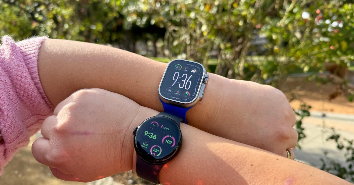
Apple has been using a rounded square design throughout the Apple Watch’s life, even with the Apple Watch Ultra. Though many rumors of big redesigns existed leading up to the Series 7 and the Series 10, Apple stuck with the tried-and-true square design. And while it works, it also looks like a piece of tech on your wrist. It’s not quite as elegant as a traditional timepiece.
That’s where Android smartwatches differ. Popular models from Samsung and Google use a circular body, which is more akin to the traditional watch style. It looks less nerdy or geeky, per se, and I feel like it just looks better overall.
Originally, I wasn’t sure if I would like a circular watch face when looking at my notifications, messages, apps, and whatever else. In practice, though, it’s not bad at all. Sure, some things will get cut off a bit due to the circular bezel, but the aesthetic looks more elegant overall and makes up for it, in my opinion.
In my short time with it, I’ve come to like the round and smooth design of the Pixel Watch 3 more than the very square shape of my Apple Watch Ultra.
The watch faces feel fresh and fun

Ever since I got my Apple Watch Ultra, I’ve been a big fan of the Ultra Modular watch face. Before the Ultra, I pretty much just used the regular Modular face. These aren’t the most exciting watch faces, but they give me all the information I need to know at a glance. But they’re not very fun.
Right now, on my Pixel Watch 3, I’ve settled on the Active watch face in the Rosebush color theme since it combines my two favorite colors: pink and green. It’s gorgeous and unique, and it gives me enough space for applications that I want to check on throughout the day.

I love how much variety there is with the watch faces, as well as the color schemes. On the Apple Watch faces that allow for color changes, you typically get either a single color or multi-color, but surprisingly, Apple doesn’t have dual-tone color schemes for most of the available Apple Watch faces.
With the Pixel Watch 3, there are many watch faces with fun fonts, bold colors with dual-tone combos, gradients, and more. It feels so much more fresh and fun, and a lot of these color combos are fantastic. I’ll be going through more of the watch faces and color combinations on my Pixel Watch 3 in the coming weeks, but for right now, I’ll be sticking with Active Rosebush. This is a lot easier to match with outfits or occasions.
Wear OS 5 is pretty great

As someone who only used watchOS all these years, I never had experience with Wear OS until the Pixel Watch 3. And I have to say that I’m pretty impressed.
The Pixel Watch 3 features the Snapdragon W5 chip inside, the same as the Pixel Watch 2. So far, I’ve found performance to be fast, snappy, and very responsive. There has been no delay when I open apps, which I can’t say the same for my Apple Watch Ultra — sometimes, it takes a while for the workout to start when I use the Action button shortcut.
I also noticed that the Pixel Watch 3 is better at automatically detecting if I’m exercising, such as the long walk back to my car from Disneyland. That prompt came up at least twice during my full day in the parks, but it did not appear on my Apple Watch Ultra.
Furthermore, I’ve enjoyed the clean aesthetics of Wear OS on the Pixel Watch 3, and navigating through the interface is actually quite simple. Swiping left and right to view your tiles/widgets, swipe down for Quick Settings, and swipe up for notifications — it’s all very intuitive. I wish watchOS had a quicker way to get to the settings like that.
A great non-Apple smartwatch

Again, I’ve been an Apple Watch wearer for the past decade, and it’s really all I’ve known until now. But after using the Pixel Watch 3 for a bit, I have to say I love it.
The round design just looks so much nicer than the square of the Apple Watch and brings the traditional timepiece aesthetic into the digital age. When you combine the round design with the fun and colorful variety of watch faces that the Pixel Watch 3 offers, there are a lot of ways to dress it up or down. I also love the fact that there are unique dual-tone faces with some color combinations. I really can’t get enough of those.
Wear OS 5 is also much more intuitive than I thought. It’s easier to navigate, the interface is simpler than watchOS, and performance has been fast and snappy. The battery life is also impressive, matching my Apple Watch Ultra on most days (ending with about 50% left).
I’ve always been an Apple Watch user, but the Pixel Watch 3 has shown me that some great non-Apple smartwatches are out there. If I were primarily using my Pixel 9 Pro instead of my iPhone 16 Pro, I would be happy to make the full switch over with Pixel Watch 3 — it really is that good.


+ There are no comments
Add yours